So, here were the directions. I will bold the main instruction because she was a bit heavy on the narrative side.
1.) Today was an interesting day! I won’t bore you with all the details, but one important thing I did was sign up for a Twitter account! Now I can say “I ‘tweet’, do you?” lol Since the default colors of Twitter are blue and white, let’s use those as our main colors…choose any paper/papers with any combination of blue and white…that’s pretty broad, I’m sure you’ll come up with something! *Ü*
2.) Did you find some truly fantastic papers? Great! Twitter (in case you are curious) is a way to broadcast information…(similar to Facebook and MySpace)…let’s “broadcast” some photos! lol Use a photo collage or “spray” or cluster to distribute your photos. You should have at least three photos to do this…if you don’t have a frame cluster to use, here is a place to get one (or more) for free: http://www.storeide.se/gunhild/Scrapbooking.htm (she offers many choices on this page!)
how you all doing? got some lovely papers? got some photos? got a collage type thingy going on here?
3.) Did you surmise that Twitter’s symbol is a bird? I bet you did! And I’m sure you’ve already guessed this step, too! Add an animal…lucky you if one of your photos already has an animal in it! (Mine does!) Don’t forget to SAVE!!!
4.) My first post on Twitter was about this Speed Scrap…that first post, it’s the first thing you see…it’s a lot like a welcome mat, isn’t it? Add a “mat” to your layout…a bracket mat, a square, circle or other shape…any kind of “mat” – it could be paper, plastic, fencing, etc. Place it under your photos. Like your front porch, dress up your layout…embellish as desired!
5.) This is really cool…it took me a while to figure out how to do it, but I did! Twitterfeed will take whatever I post on my blog and duplicate it on my Twitter! Yay! Duplicate something in your layout! Hmmmm…wonder what you’ll duplicate?
6.) Having a blog and a tweet is a lot like having a title and a subtitle…take an alpha, make a simple title, then use a font to give it a subtitle! Hehehe….I hope you’re having as muchas I am!
7.) Last step ladies…I’ll make this one easy…shadow as needed and journal if you want, and follow me on Ttwitter! http://twitter.com/merchimakesit That’s it! lol I hope you had a great time! I had a lot ofmaking up these instructions, and I hope you had just as much
following along!
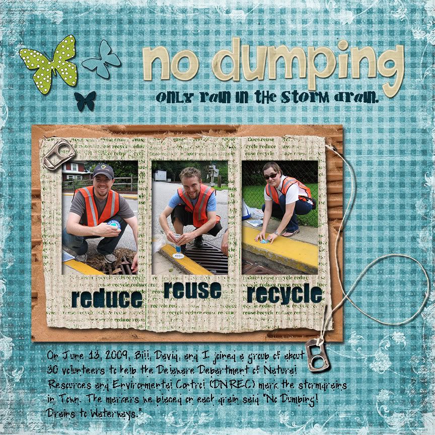
And here is what I came up with:

The journaling gets messy when I downsize the resolution. It says:
"On June 13, 2009, Bill, David, and I joined a group of about 30 volunteers to help the Delaware Department of Natural Resources and Environmental Control (DNREC) mark the stormdrains in Town. The markers we placed on each drain said "No dumping! Drains to Waterways."
"Stormdrain Marking"
CREDITS:Papers and butterflys: "Earth Wings #2" by Julie Marie Designs
Cardboard mat and soda tops: "Earth Day" by Mary Wilde, Plum Dumpling Designs
Cluster frame: "Green" by Creashens
Alpha: "Promise Collection" by Shabby Princess Designs
Fonts: Cry Kitty & Pea So Lovely both by Kevinandamanda.com


No comments:
Post a Comment