I wanted to share my experience using Shutterfly with you.
I've been waiting til after Christmas to write this because the book I made was a surprise scrapbook for my husband. Of course the book has been wrapped for a while so I haven't had a good look at it in several weeks, but I think I remember the key points.
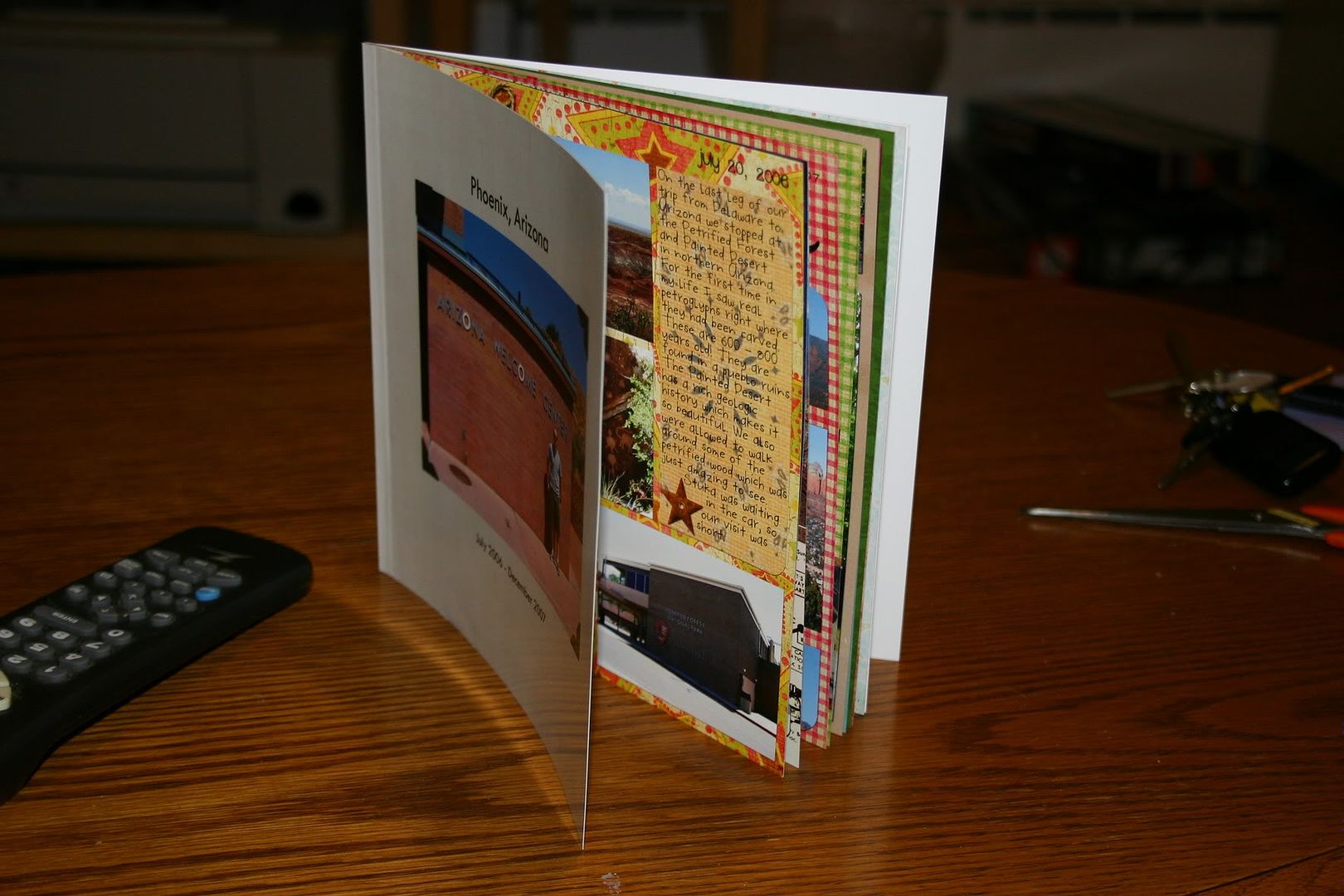
I scrapbook in 8" x 8", so I went for the 8" x 8" book. This ended up being a really good sized book. So if you scrapbook in 12" x 12" and want to go cheaper with a smaller book, I think you will be happy with the results. Just be aware of the size of your text when you shrink it. You could test this by printing it to any standard printer (b&w or color).
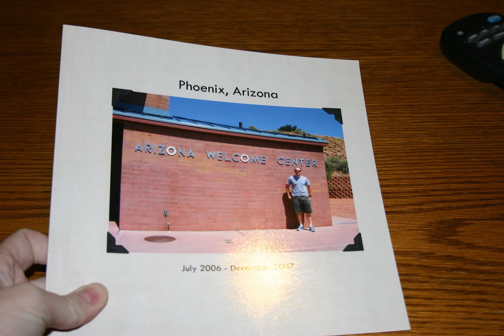
For the front and back of the book, I just inserted regular photos into the templates. If you could do more than that, I am not aware of it. But I found some really good pictures that went with the whole theme of my album. The album I made was of our time in Arizona (hence the scrapbook pages of Arizona I've been posting lately) and I put a picture of the Arizona Welcome Center on the cover and a shot of the temperature as read by our car on the day we arrived---117*---on the back.
For all of the inside pages I chose a template that allowed me to insert a "picture" (my scrapbook page) the entire size of the page (8" x 8"). I wish I had pictures of this (I might update this later). Sorry.
The book had 20 pages. The first page is on the right, with the inside cover on the left. Shutterfly calls this the title page, but I just jumped right in there and started with my first scrapbook page. The last page (page 20) is on the left, with the inside back cover on the right. There were 9 sets of paired pages (i.e., one page on the left and one on the right) if you are a 2-page scrapper.
I found it rather easy to work with the interface. If you are all set ready to go, it probably would take about one hour or less to upload all of your photos and arrange them in the correct order in the book.
Issues
I found two issues with the book, which I didn't know about until I was holding the actual book in hand. So be forewarned.
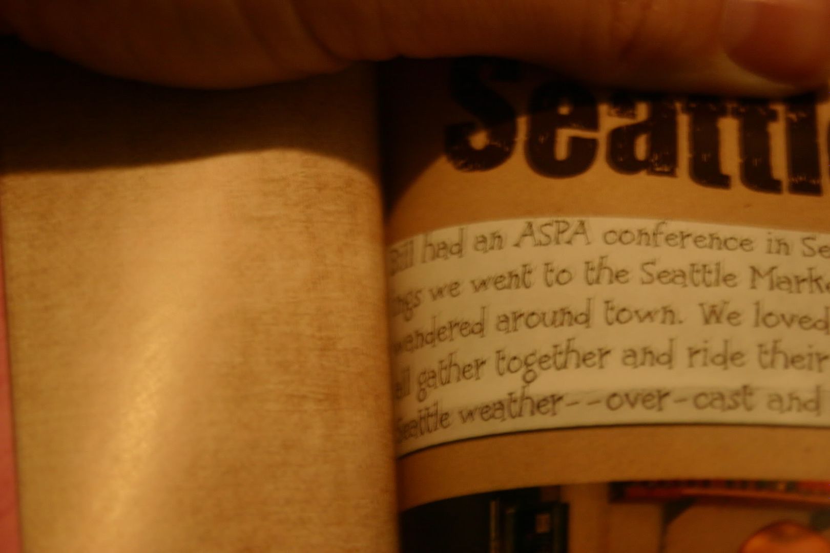
- I'm not sure what the technical term is for the inside of the book where the pages meet, but I'll just call it the gutter. Well, the biggest problem I saw was that your page gets lost in the gutter. I had at least two pages in the book where the text gets lost inside the book. So, I would recommend that you alter your scrapbook page according to where it will fall in your book. Either make sure nothing significant falls within at least 1/2 inch of the edge OR if you know if the page will fall on the left or right, make sure that the inside edge is free of elements and text that you want to make sure are visible.
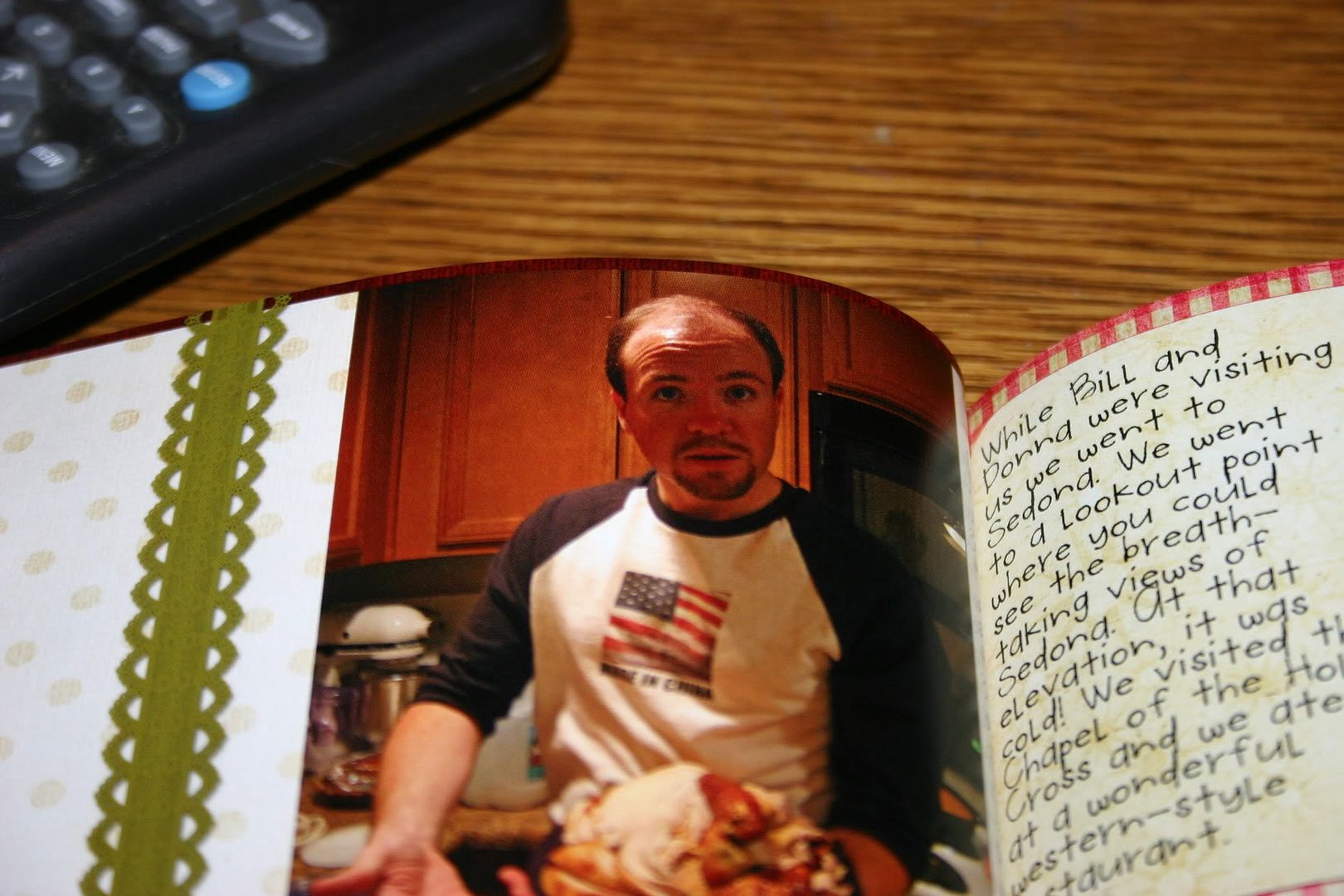
- The other major issue is that the text prints dark. Just as printing on card stock appears darker than photo paper when using colored ink, I found the paper that they use absorbs the color and makes it appear darker. Before I submitted my pages I printed all of them on photo paper using my laser jet and they looked great. However, the Shutterfly book seemed particularly bothersome to faces, which all came out too dark. Otherwise the colors were very vivid and looked great. So I guess I would suggest lightening any photos of people on your scrapbook page before submitting it to Shutterfly.
Otherwise I was happy with the feel and look of the book. I went with the soft cover and thought it was fine---thick enough. The pages have a soft gloss look to them, but I didn't see any finger prints making a mess of the pages. I'm not 100% on this because I was careful when handling the book.
Would I shop at Shutterfly again? Yes! Knowing what I do, I think in the future I will make the slight alterations that I suggest above. I thought the book was affordable and a wonderful gift.
February 19, 2010 Update:
Also check out this review of a Shutterfly photobook by Shaz of It's My Kraft Nook
and these photos of a Shuttefly photobook by Keyr of Dreams Inspired
February 19, 2010 Update:
Also check out this review of a Shutterfly photobook by Shaz of It's My Kraft Nook
and these photos of a Shuttefly photobook by Keyr of Dreams Inspired





2 comments:
Hey, I just wrote a review of Shutterfly too. I think we had the same issues. too dark. I note it as too much blue and not enough contrast. Wish I had read you review first. I am going to link your reviw to my post OK!
Thanks.
awesome!! Why not submit it here?? http://tinyurl.com/yzr52zm
Post a Comment