Showing posts with label digitial scrapbooking. Show all posts

Sunday, February 7, 2010

Project 365 Weeks 4 & 5

I'm getting behind on my layouts and it's only February! This already seems like a momentous task! The hardest part is that my camera is so big, I don't feel like carrying it anywhere, so all of my pictures are made at home. How fun is that?!
Anyway, here are the layouts for Project 365 and Project Cole & Lillie 365.

Week 4:

  
Kit - "Celebrate" by SuzyQ Scraps, Template - "Project 365 Temp. 2" by Connie Prince; Font - "Pea Madsen" by Kevinandamanda.com

Kit - "Butterfly" by Audacious Designs; Template - ?; Font - Traveling Typewriter, "Pea Madsen" by Kevinandamanda.com
Week 5:


Kit - "Celebrate!" by SuzyQ Scraps; Template - "Project 365 Template No. 6" by Scrapmuss Designs; Font: "Pea Madsen" by kevinandamanda.com, Traveling Typewrite; Date stamp: "Simply Dated v.4" by wm[squared]

 
Kit - "Butterfly" by Audacious Designs; Template - ?; Font - "Pea Madsen" by kevinandamanda.com, "Traveling Typewriter"

Wednesday, January 20, 2010

Week 3 Project 365

Here are my layouts for Project 365 and Project Cole & Lillie 365. I'm starting to fall off the wagon with the project 365, but going strong with the Cole & Lillie.


CREDIT:  Kit: "Celebrate!" by SuzyQ Scraps; Template: Project 365 Template 17 by Sweet Tomato Designs; Fonts: "Pea Madsen" by Kevinandamanda.com, and Traveling Typewriter


CREDIT:  Kit: "Butterfly" by Audacious Designs; Template: "Project 365 Week 20" by 3s Enough; Font: Traveling Typewriter

Sunday, January 17, 2010

Sweet Nothings by Dylabel Designs

Just wanted to share with you this really darlin' kit for Valentine's Day. I love pink so I'm totally in love with this kit. I've scrapped some pictures from my wedding and honeymoon with it.


 "Sweet Nothings" Kit by Dylabel Designs; font: "joeHand2"
 
CREDITS: "Sweet Nothings" by Dylabel Designs; font: "Pea Madsen" by kevinandamanda.com
Didn't we have the most beautiful wedding cake ever? Those were my colors: pale pink and a fun pale taffy orange. Loved it!

Saturday, January 16, 2010

Week 2 - Project 365

Today I'm showing you the layouts from Week 2 for Project 365 and Project Cole & Lillie 365.


CREDITS: "Celebrate!" by SuzyQ Scraps; Fonts: Pea Madsen by Kevinandamanda.com, and Traveling Typewriter; Project 365 Template 19 by Sweet Tomato Designs; Datestamp: "The only date stamps you'll ever need" by Stolen Matters Designs

 
CREDITS: "Butterfly" by Audacious Designs; Font: Renaissance?

Thursday, January 14, 2010

Wait

I have had the word "wait" on my mind for two weeks now, thinking that would be my word of the year. They quoted a verse using the word wait in Sunday School last week and I thought, "that is the Lord speaking that word to me."

Well since that day I have had the worst week in my life, in these 30 years I've been here on earth. No exaggeration. I thought my Grandma's death was horrid this past summer, but I have now experienced worse. I mean 2009 was up-to-date the worst year of my life, and I thought 2010 had to be looking up, but we're just two weeks in and I'm wishing away this year! The age 30 has come with a lot of problems. What I'm speaking of is a personal matter not to be broadcast across the Internet.

So, anyway, in my pain, I decided to go ahead and scrap my word of the year. This idea of a word of the year comes from Ali Edwards.

There are many verses on waiting on the Lord, but I went with something raw that spoke to me in my pain. That is simply that He "heard my cry." I am clinging to that. I need to know that if nothing else changes, at least God is there and knows how hard this is for me. As I go through this I will wait on Him and His timing and trust that He will not give me anything that He can't handle through the Holy Spirit.

CREDITS: Paper--from "Spontaneous Delight" by Carrie Stephens; Alpha--Alpha 04 by Deca Designs; Font--Berlin Sans; Datestamp--Project 365 Essentials V.1 by [wm]squared; Stitching--from "Green" by Creashens

Friday, January 8, 2010

Week 1 - Project Cole & Lillie 365

Yep, I'm doing 365 of my dogs, too. I thought it'd be fun and at the end I might have some neat pictures of them to remember their "terrible twos."
So here is my layout of Cole and Lillie and you can have the template if you'd like it. Download below.

CREDIT: "Butterfly' by Audacious Designs; Fonts: Traveling Typewriter & Pea Madsen
and the template--Photoshop/Photoshop Elements file included (click image to download):

Thursday, January 7, 2010

Project 365 Week 1

I'm not sure how faithful I will be about posting my scrapbook pages of Project 365, but here is week #1 (Friday & Saturday, January 1-2).

CREDITS: Kit-"Celebrate!" by SuzyQ Scraps; and Font-"Pea Madsen" by kevinandamanda.com
I think I'm going to make all 52 layouts from this one kit. We'll see how it goes making that much variety from one kit. But it's a good sized kit, including 22 papers and plenty of elements. I love the bold colors.


Happy scrapping!

Friday, January 1, 2010

Date Stamp for Project 365!

I have to admit that I am a sucker for date stamps. I found some that are not just worth checking out, they are worth blogging about! I mean I don't just promote random material on this blog. But these are worth sharing with you, and buying if you are doing Project 365. Check them out and click the image to go to the store---it's on sale right now.


Contains:

  • 365 numbered stamps
  • 12 month stamps
  • 7 day of the week stamps
  • "week" & "day" stamps
  • year stamps 2000-2015
  • 12 month rings
  • 7 day of the week rings
  • yearly rings 2000-2015
  • 3 additional rings for 365 days, 52 weeks & 12 months

Sunday, December 27, 2009

Review of Shutterfly Experience for Scrapbooking

I wanted to share my experience using Shutterfly with you.


I've been waiting til after Christmas to write this because the book I made was a surprise scrapbook for my husband. Of course the book has been wrapped for a while so I haven't had a good look at it in several weeks, but I think I remember the key points.

I scrapbook in 8" x 8", so I went for the 8" x 8" book. This ended up being a really good sized book. So if you scrapbook in 12" x 12" and want to go cheaper with a smaller book, I think you will be happy with the results. Just be aware of the size of your text when you shrink it. You could test this by printing it to any standard printer (b&w or color).
 
(click pictures for larger view)

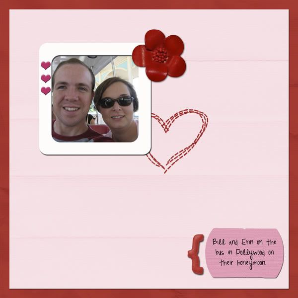
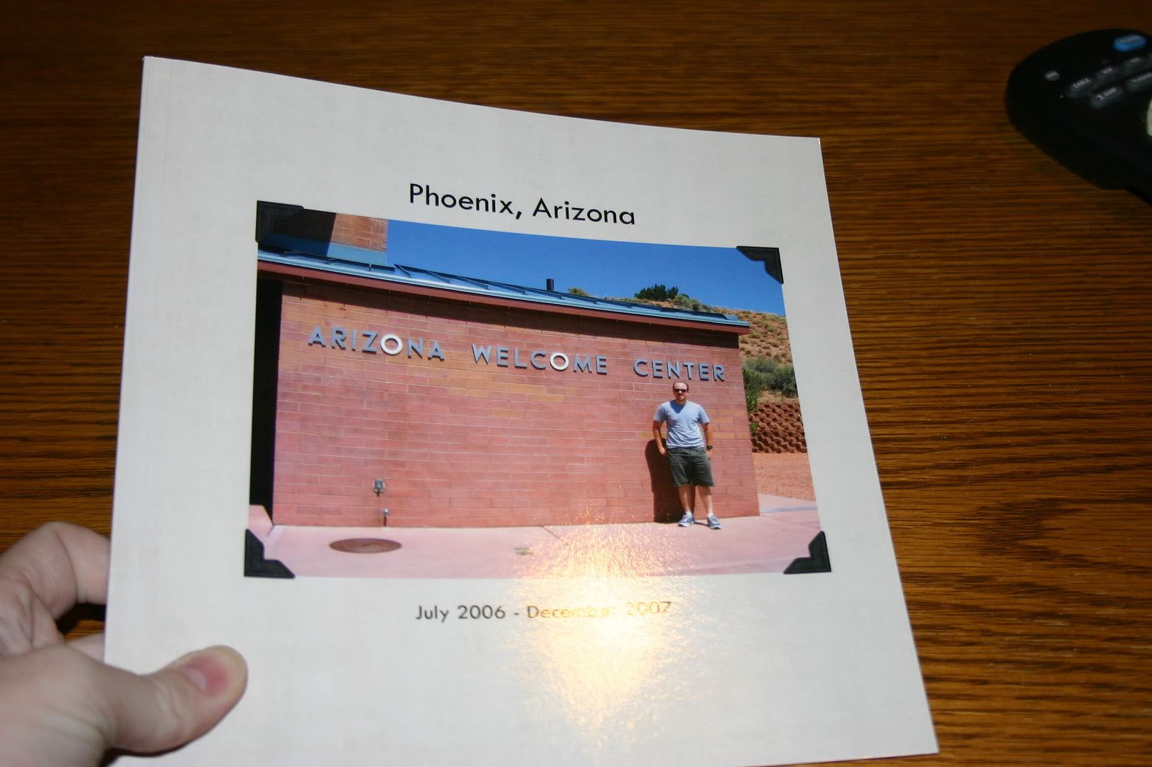
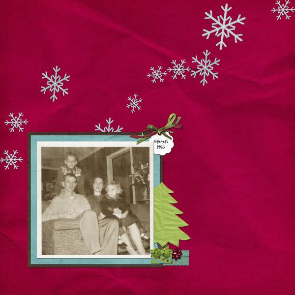
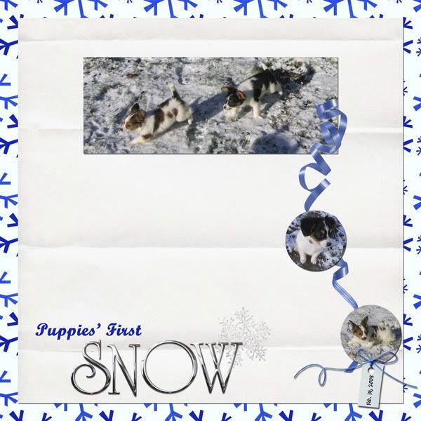
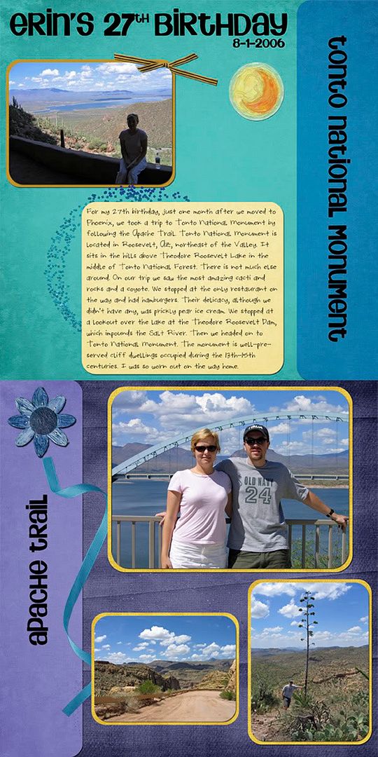
For the front and back of the book, I just inserted regular photos into the templates. If you could do more than that, I am not aware of it. But I found some really good pictures that went with the whole theme of my album. The album I made was of our time in Arizona (hence the scrapbook pages of Arizona I've been posting lately) and I put a picture of the Arizona Welcome Center on the cover and a shot of the temperature as read by our car on the day we arrived---117*---on the back.

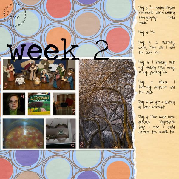
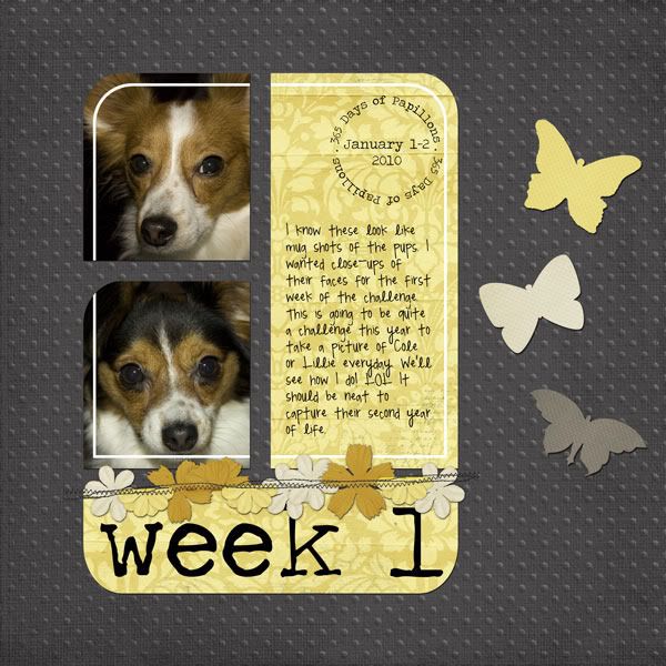
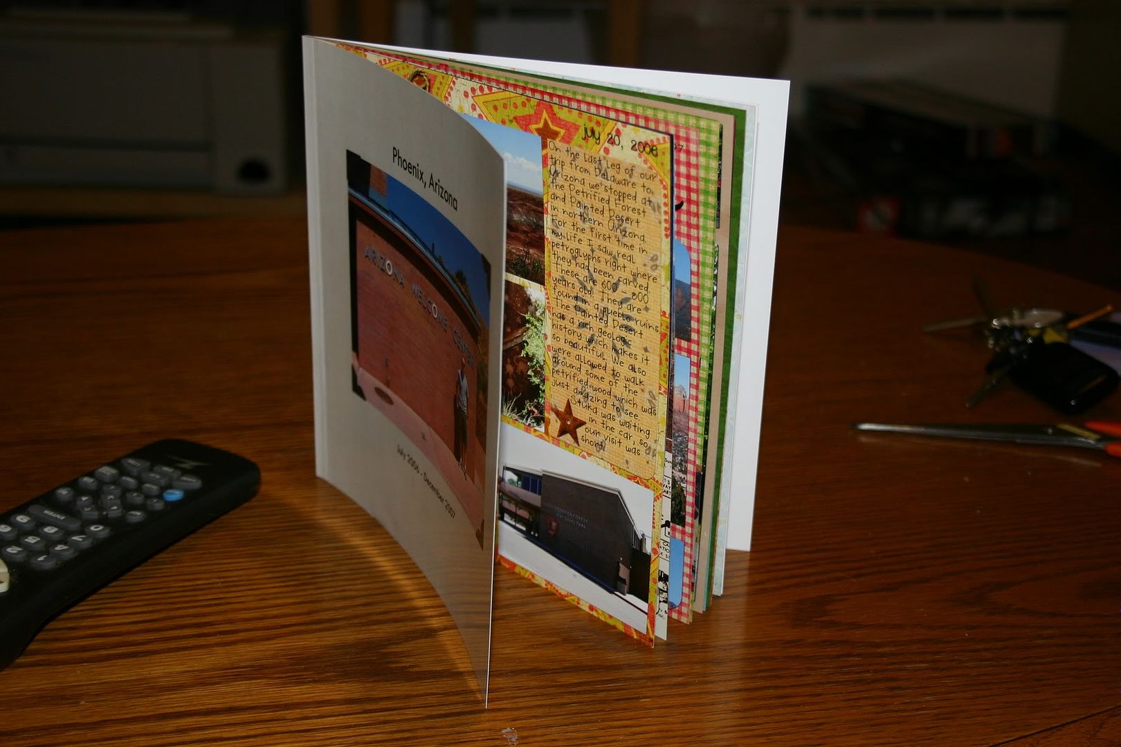
For all of the inside pages I chose a template that allowed me to insert a "picture" (my scrapbook page) the entire size of the page (8" x 8"). I wish I had pictures of this (I might update this later). Sorry.

The book had 20 pages. The first page is on the right, with the inside cover on the left. Shutterfly calls this the title page, but I just jumped right in there and started with my first scrapbook page. The last page (page 20) is on the left, with the inside back cover on the right. There were 9 sets of paired pages (i.e., one page on the left and one on the right) if you are a 2-page scrapper.


I found it rather easy to work with the interface. If you are all set ready to go, it probably would take about one hour or less to upload all of your photos and arrange them in the correct order in the book.

Issues
I found two issues with the book, which I didn't know about until I was holding the actual book in hand. So be forewarned.  
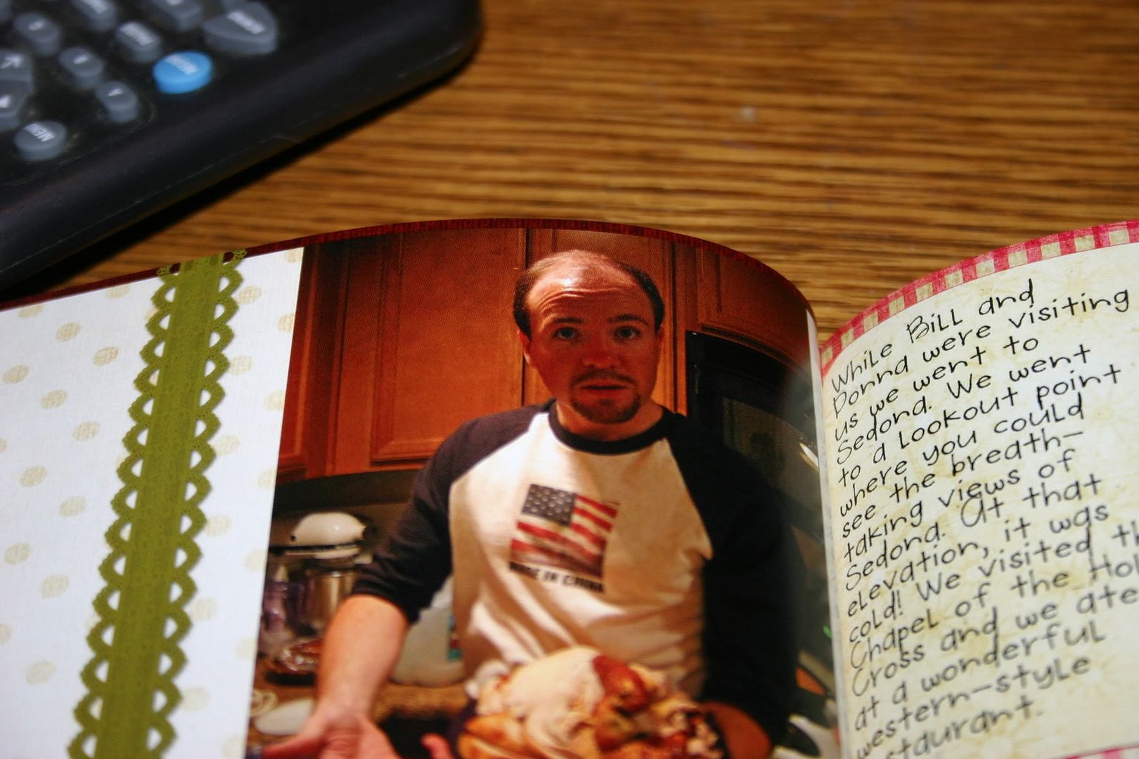
  1. I'm not sure what the technical term is for the inside of the book where the pages meet, but I'll just call it the gutter. Well, the biggest problem I saw was that your page gets lost in the gutter. I had at least two pages in the book where the text gets lost inside the book. So, I would recommend that you alter your scrapbook page according to where it will fall in your book. Either make sure nothing significant falls within at least 1/2 inch of the edge OR if you know if the page will fall on the left or right, make sure that the inside edge is free of elements and text that you want to make sure are visible.
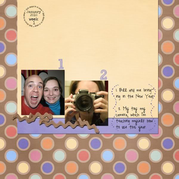
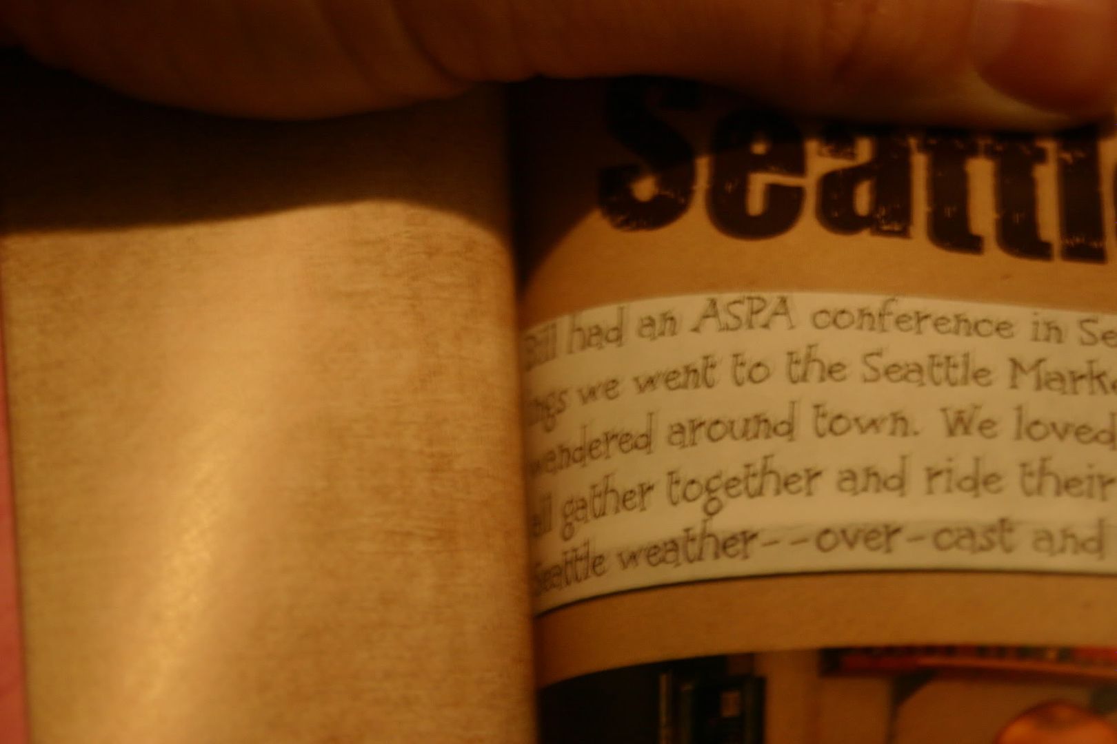
  2. The other major issue is that the text prints dark. Just as printing on card stock appears darker than photo paper when using colored ink, I found the paper that they use absorbs the color and makes it appear darker. Before I submitted my pages I printed all of them on photo paper using my laser jet and they looked great. However, the Shutterfly book seemed particularly bothersome to faces, which all came out too dark. Otherwise the colors were very vivid and looked great. So I guess I would suggest lightening any photos of people on your scrapbook page before submitting it to Shutterfly.
 
 
Otherwise I was happy with the feel and look of the book. I went with the soft cover and thought it was fine---thick enough. The pages have a soft gloss look to them, but I didn't see any finger prints making a mess of the pages. I'm not 100% on this because I was careful when handling the book.  

Would I shop at Shutterfly again?  Yes! Knowing what I do, I think in the future I will make the slight alterations that I suggest above. I thought the book was affordable and a wonderful gift. 

February 19, 2010 Update:
Also check out this review of a Shutterfly photobook by Shaz of It's My Kraft Nook 
and these photos of a Shuttefly photobook  by Keyr of Dreams Inspired

Tuesday, December 15, 2009

Scrap It To Me Tuesday with Holly Jolly

If you don't know what Scrap It To Me Tuesday is, click here.

This week I'm featuring my most recent scrapbook page. It's with the cutest kit---Holly Jolly by Dylabel Designs and genia Beana.

This year is the first year we could afford a real full-sized tree. The number of ornaments is lacking, but it is a beautiful tree. We had so much fun decorating it. The colors of the kit matched our tree skirt perfectly.

"Holly Jolly" Collab by Dylabel Designs and geniaBeana; font: A Red Bucket and Pea Megeletto both by kevinandamanda.com

Tuesday, December 8, 2009

Scrap It To Me with Cowgirl Cool

Scrap It To Me Tuesday

It's another "Scrap It To Me Tuesday" with Chanin from Chanin's Corner. I'm in an earlier time zone than Chanin so I'm posting before she gets hers up, but I'm doing it now while I have the time.

I thought I'd continue with the series I started last week, which is of our trips in Arizona. Last week I showed you Grand Canyon National Park. This week I'm showing you a trip we made the day before going to the Grand Canyon---to Meteor Crater. Meteor Crater is just that: a crater near Flagstaff, AZ where a meteor struck the earth a very very long time ago.
I used Raspberry Road Design's Cowgirl Cool Collection. Click the images of the elements and papers to be taken to the Raspberry Road store.

alternative text
Credits: "Cowgirl Cool" by Raspberry Road Designs; Font: Tiza

Friday, December 4, 2009

Harvest Blessings Release and Freebie

So I got to play with another kit this week. It's called Harvest Blessings by Dylabel Designs. It's 35% off all this week! I've created a layout and a freebie using it. Check them out....and my freebie is being hosted on Dylabel Designs' website. Links to her page.

Great Tutorial on How to Use Templates

The only template I've ever made. Please feel free to snag it. (click template image to download)

When I started this blog I really concentrated on helping new digi-scrappers. As I've grown in my scrapbooking skills I have gotten away from that and kind of forgotten what would be typical questions from a newbie-scrapbooker. It was a lot easier when I was one myself. Funny how scrapping over 6 months and making approximately 75 layouts has brought me this far. And I am sure to many digi-scrappers out there I am just scratching the surface! But I am working on it. I have been scrapping up a storm these last few weeks---making about two a day for a couple of weeks. But the creative juices are starting to dry up and my momentum is slowing down.

Anyway, all of that to say that I came across a great video that will help someone newer to digi-scrapping. It is how to use templates. I know there are lots of good tutorials on this, but I still learn something new when I watch them because everybody has a different way of going about scrapping. It helps me learn the ins-and-outs of the program better.


Today's tutorial is by Cathy Zielske. I love her style, personality, and her templates and if I were not cheap I probably would own all of her templates for square pages. Here's a link to her tutorial on templates:
http://vimeo.com/7968334 and here's a link to her blog: http://cathyzielske.typepad.com/my_weblog/2009/12/video-tutorial-working-with-layered-templates.html. What is even neater is that she turned this into a hybrid page when she was finished doing the digital part, so be sure to check out her blog.

Tuesday, December 1, 2009

Scrap it To Me with On The Road

I've decided to join Chanin from Chanin's Corner in a blog hop. Every week people will blog about a layout they made that week and share the links to the kits they used. It's a great way to get inspiration for your scrapping and to find out about great scrapbooking kits.

My layout is of our first anniversary, when we made our first trip to Grand Canyon National Park. I just love how this layout turned out.
Grand Canyon
"On the Road" by Audacious Designs; scraplift from Cathy Zielske's 10 Things Right Now; Font: "Turtle Club" by Kevinandamanda.com
I used the following kit from Audacious Designs. Unfortunately, I don't know if it is available anymore because the store I bought it from shut down. But it's a wonderful kit if you can get your hands on it.

On the Road by Aud Neal

Friday, November 27, 2009

2 New Releases and freebies

I just wanted to share some kits with you that I played with this week. They are available at GoDigitalScrapbooking.com.

First is a collaboration by Dylabel Designs and geniaBeana Scraps called Holly Jolly. Here is the kit, my layout, and a quickpage from the layout. The layout includes a picture of my mother's family when she was just 4 years old. It was a funny reddish color so I altered the photo to make it look old but more natural.

and a quickpage:
The quickpage is linked, click image to download.


This is the second kit, Happy Hanukkah, that I played with this week by Dylabel Designs. I am a Christian so I went with a snow motif instead of Hanukkah. This kit worked really well for that as well. I loved the pictures I used in the layout of the puppies playing in the snow when they were just 9 weeks old---only days after we got them.

and a freebie cluster frame that I made using Happy Hanukkah by Dylabel Designs. The frame is linked. Click the image to download.

Friday, November 20, 2009

Sweet Pea Release and Freebie

Hey! I have another layout from a new release by Dylabel Designs to show you today. She has this adorable kit called Sweet Pea which has the perfect combination of pinks and greens. It is in the store at GoDigitalScrapbooking.com for 35% off all this week.Sweet Pea by Dylabel Designs
And my layout:
CREDITS: "Sweet Pea" by Dylabel Designs; font: Round Birdie by Aud Neil

and I created a quickpage for you from this layout:
Click the quickpage image to download.
Happy Friday, everyone. Have a great weekend! :)

Friday, November 13, 2009

New Release - Ode to a Starry Night and freebie

I played with Dylabel Designs' newest kit this week, called Ode to a Starry Night. I decided it is about time to start scrapping some of my pictures from Arizona before I forget what we did. I mean these pictures are over three years old now! It's hard to believe it has been that long since we moved to Phoenix. Our time there was such a whirlwind---we only lived there 17 months. Fortunately while there we did take advantage of the location and got out and experienced some really cool stuff you would never see on the east coast.

I did a two page spread of our trip to Tonto National Monument via the Apache Trail. We had been in Phoenix only a few weeks when we took this trip so it was our first real exposure to desert life, the rocks, the lizards and wildlife, and the cacti. Tonto is in the Sonoran Desert and apart of Tonto National Forest.


The CT created some freebies including word art, alpha, frames, and quickpages. Check them out at Belinda's blog:
Dylabel Designs.
CREDITS: "Ode to a Starry Night" by Dylabel Designs; journaling font: Round Birdie by AudNeil
Yes, I know the first picture is really dark, but it's the only picture we actually took at Tonto National Monument. And of course, it's of me resting because it was a HOT day (remember, August in the Phoenix area!) and a steep walk up to the cliffs.

Finally, since I made the word art, I wanted to share it with you on my blog, as well. Click to download.